TikTok Shop Seller Center: “Shop Health” Dashboard
Role
Lead Designer
Lead Designer
Business line
TikTok Shop Seller Center
TikTok Shop Seller Center
UI/UX
User Testing & Iteration
User Testing & Iteration
#e-commerce
#b2b
#pcweb
#b2b
#pcweb

Background
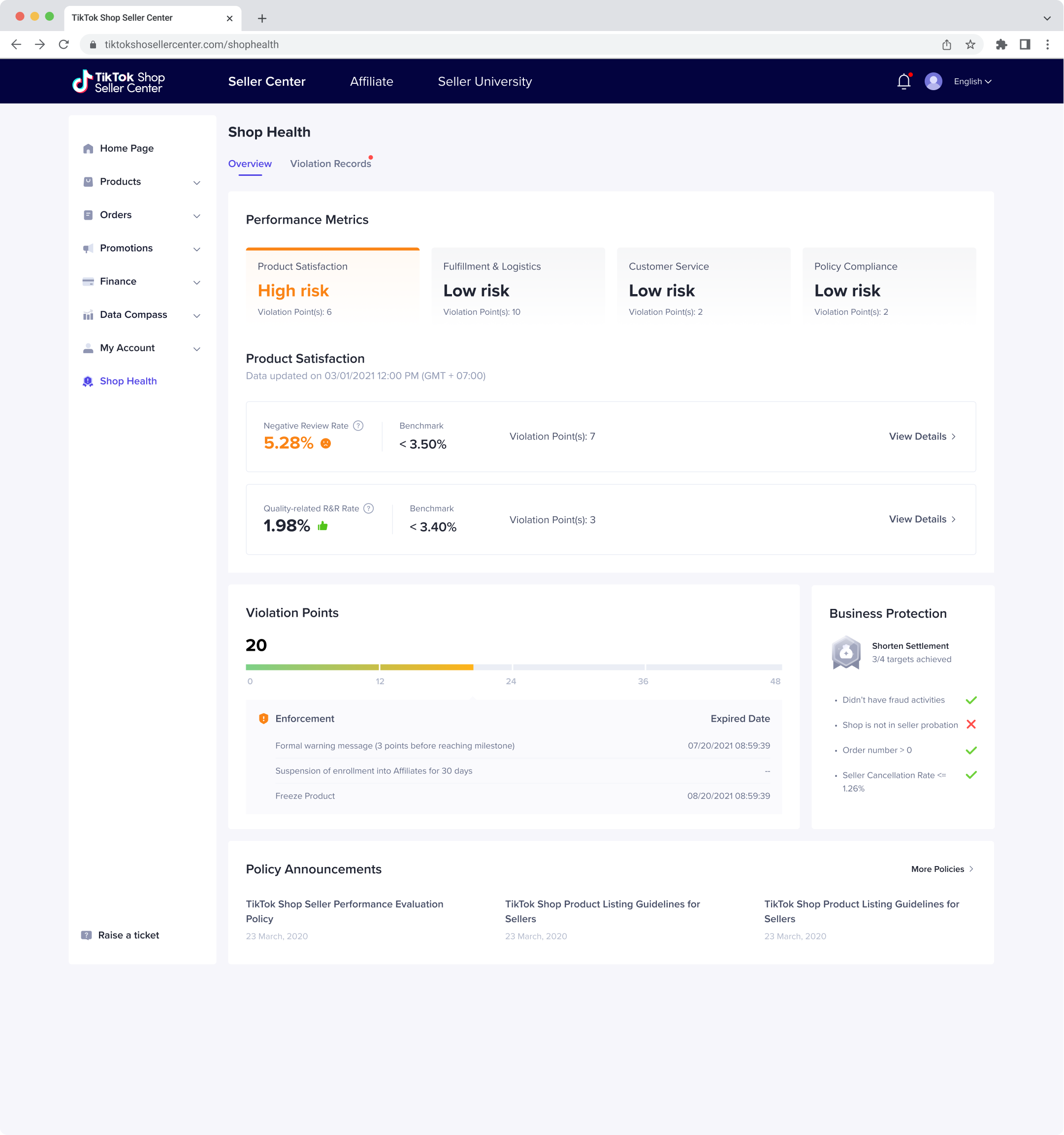
The “Shop Health” Dashboard in TikTok Shop Seller Center is a tool to help sellers view their shop performance and potential risks.
We received a lot of negative feedback from the sellers in the UK about this “Shop Health” dashboard. Then we sent out a pop-up survey. The users gave out 3.0/5 for overall satisfaction. Also, 46% of users complained the structure of the dashboard needed to be more straightforward. (Sample size: 50)
Therefore, I started this project to re-design and iterate the Shop Health page.
Therefore, I started this project to re-design and iterate the Shop Health page.
Current Challenges
Sellers find that the current Shop Health dashboard doesn't help run their TikTok Shop, and they couldn't understand the metrics and how to improve.
Sellers find that the current Shop Health dashboard doesn't help run their TikTok Shop, and they couldn't understand the metrics and how to improve.
Vison & Goal
Improve the structure of the “Shop Health” dashboard and make it easier for sellers to understand their performance with minimum development workload.
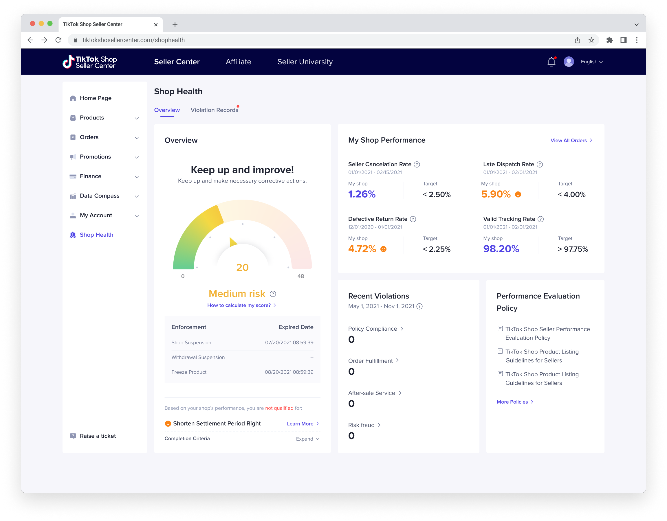
The Previous Design
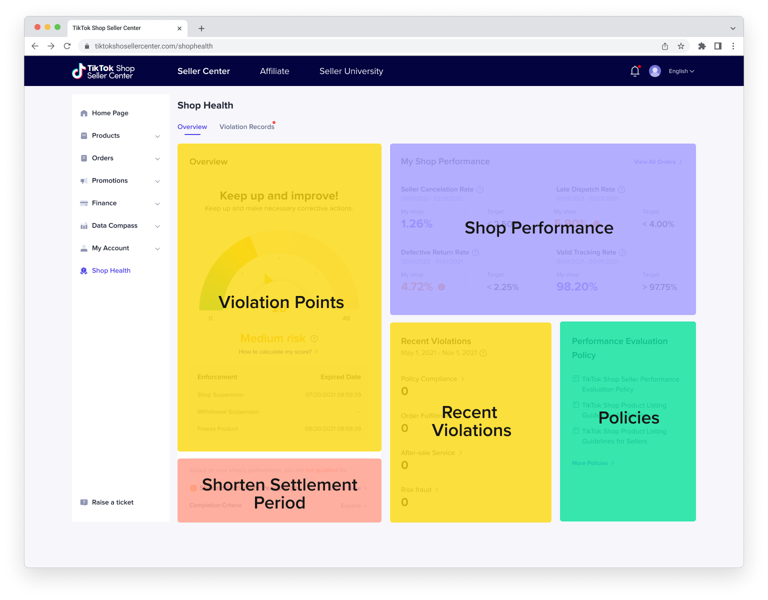
︎ Click navigation on the image to see the panel structure
︎ Click navigation on the image to see the panel structure
Problems
01
Unclear Structure
Unclear overall structure and hierarchy. The relationship between the violation points, my shop performance, and shorten settlement period is not straightforward.
02
Hard to Understand
Contents in different categories are now on the same panel, leading to many misunderstandings and frustration.
03
The Usage of Gauge Chart
Most of our competitors don't use gauge charts to show points, so we need to test the usability.
f
01
Re-structure
Re-structure
the Panels
First, isolate the “Short Settlement” panel because its qualification doesn’t relate to the “Violation Points.” Then I combine “Violation Points” with “Recent Violation” to increase their connection.
02
Simplify and Unify the Metrics
Working with the PM, we reorganized all the performance metrics into various dimensions and unified the statistical period. The goal is to simplify the logic, focusing on the current situation, objectives, and impact.
03
Change the Hierarchy
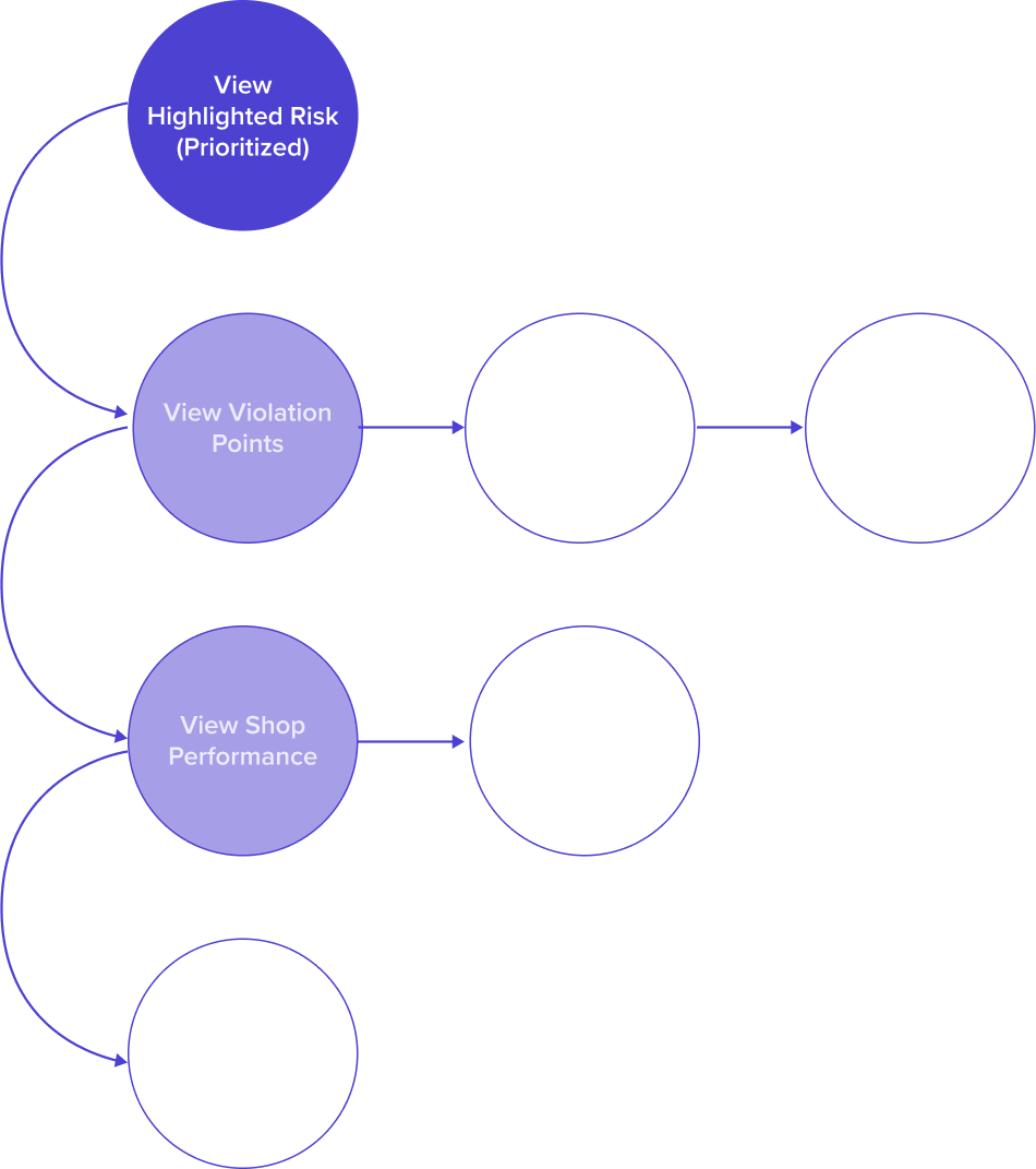
By proposing two design options to our users in usability testing, I hope to know which is more important to them: the overall violation points or the high-risk metric.
Design Option A
︎ Click navigation on the image
to see the panel structure
Keep the violation points as the focus
︎ Click navigation on the image
to see the panel structure
Design Option B
Prioritize the highlighted risk
ds
![]()
![]()
![]()
![]()
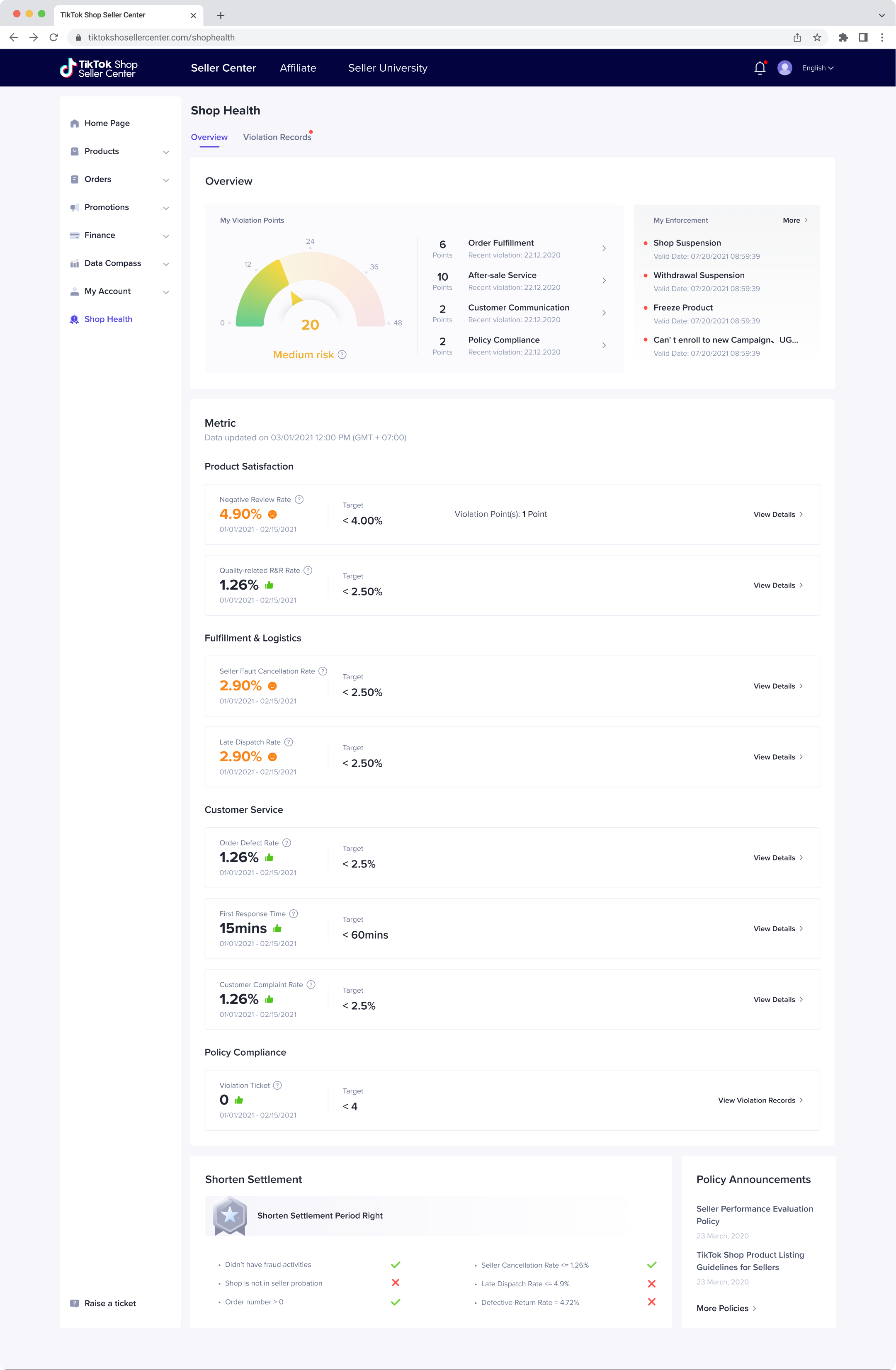
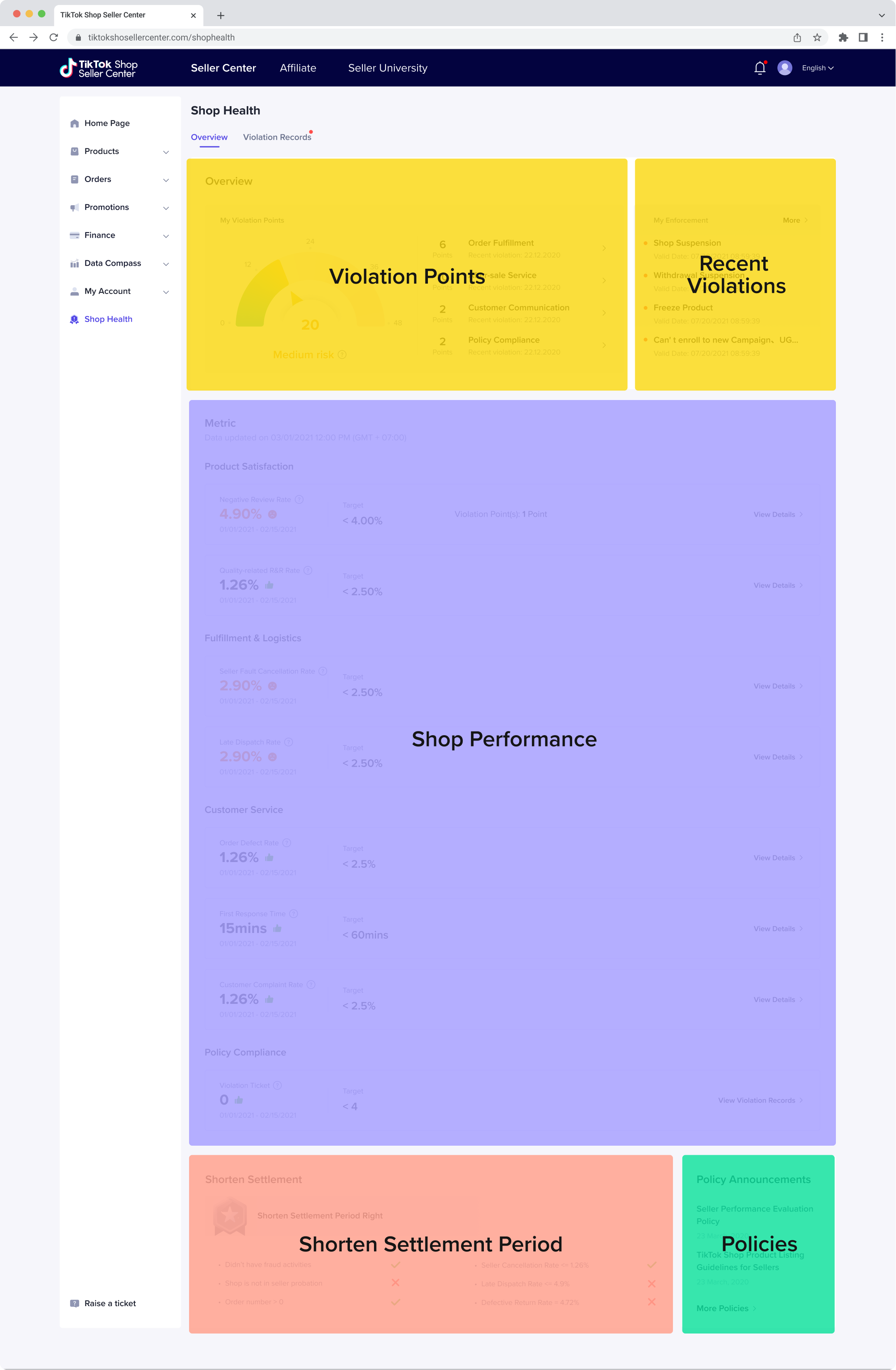

Flow Chart of Option A
![]()

Flow Chart of Option B
![]()
Next Step: Usability Testing
We organized usability testing sessions with nine TikTok sellers from UK to test out two potential solutions. We found some insights and made more changes...
Insight 1
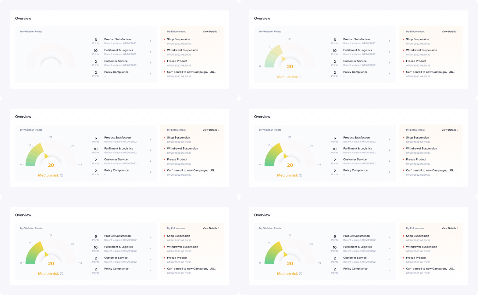
Option A is easier to understand, so does the gauge chart
According to most of the sellers, violation points as the overall risk and focus point are easier to understand than performance dimensions. So I kept the gauge chart in the iteration.
Option A is easier to understand, so does the gauge chart
According to most of the sellers, violation points as the overall risk and focus point are easier to understand than performance dimensions. So I kept the gauge chart in the iteration.
Insight 2
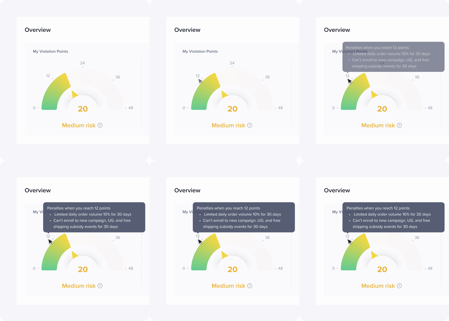
Sellers want to know the penalties when they reach specific violation points. The penalties for different levels of violation points need more clarification. So I added this hover feature to let sellers view the detailed penalties for each level.
Sellers want to know the penalties when they reach specific violation points.
Sellers want to know the penalties when they reach specific violation points. The penalties for different levels of violation points need more clarification. So I added this hover feature to let sellers view the detailed penalties for each level.
Insight 3
I redesigned the layout of performance metrics to enhance efficiency and extensibility in the future.
Performance Metrics take too much place on this dashboard
I redesigned the layout of performance metrics to enhance efficiency and extensibility in the future.

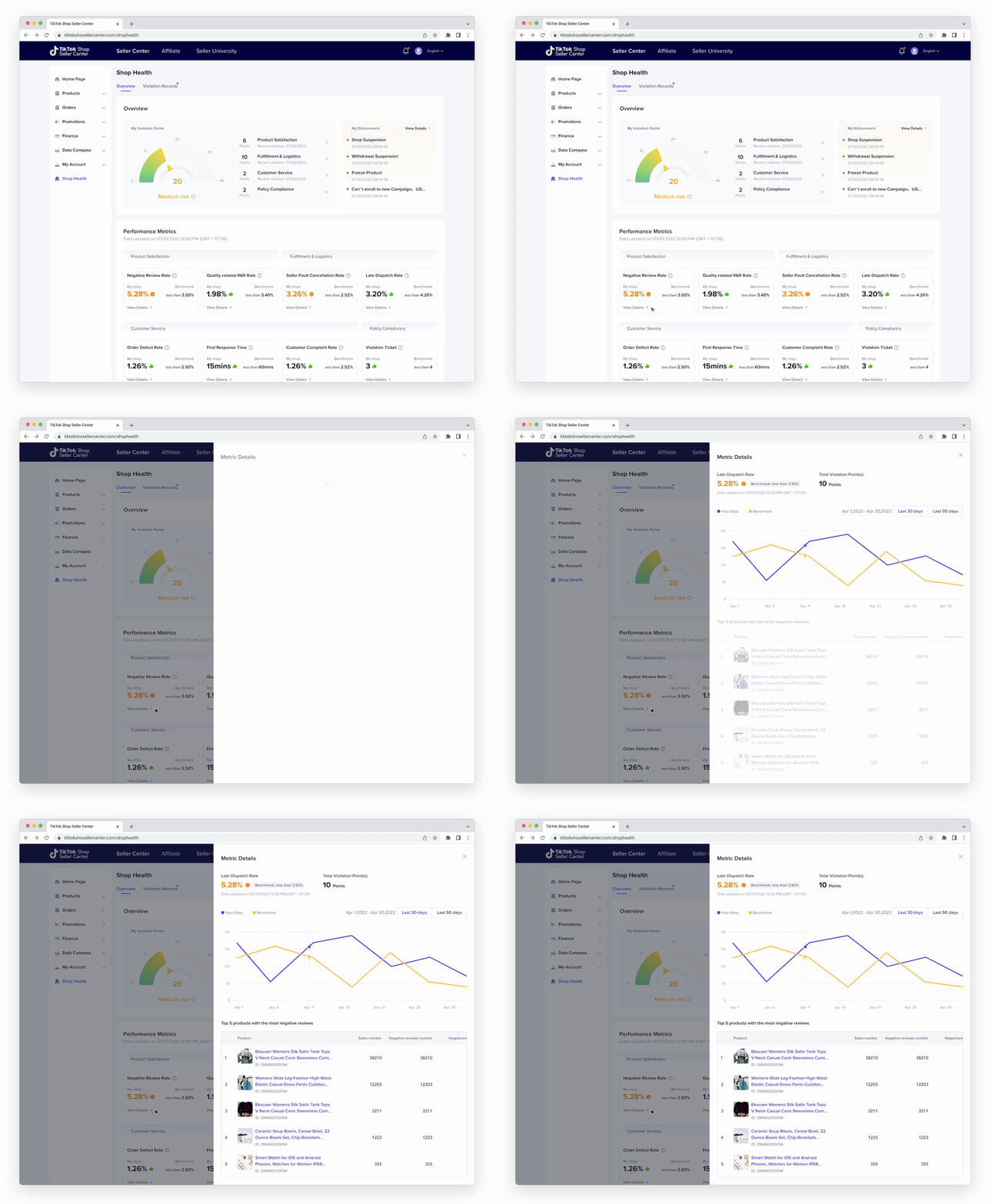
Insight 4
Sellers are more interested in how to lower the risk
Even though sellers could understand how the violation points are generated, they are more interested in how to lower the risk. I added this drawer to show them more detailed insights about each performance dimension. Then they would know how to take action.
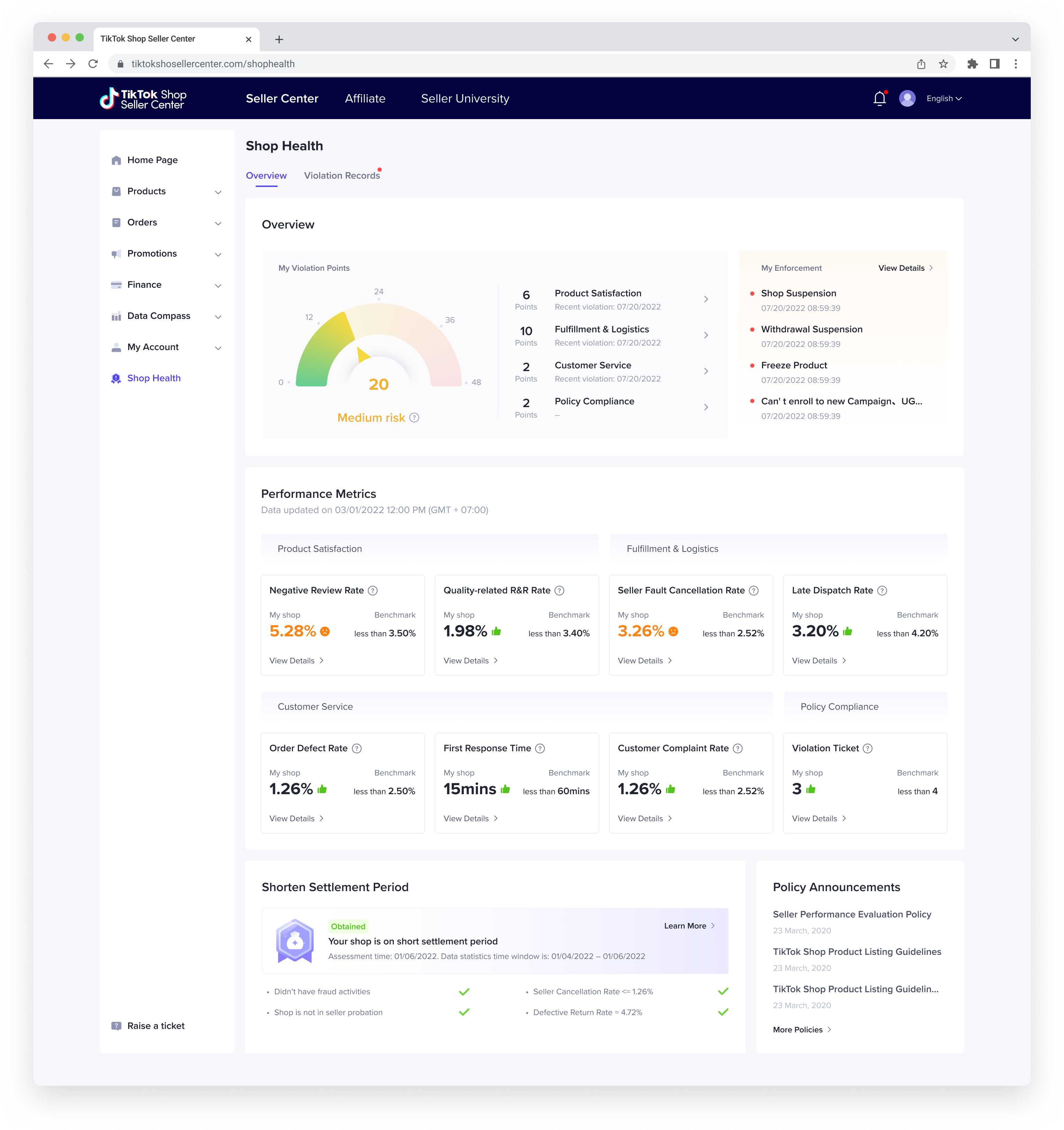
The Final Design for This Iteration
We sent another survey to 50 UK sellers two months after this iteration. This time, 85% of the sellers successfully achieved the goal of understanding and improving their shop performance. Sellers gave out an overall satisfaction score of 4.2/5.
Before
![]()

After
![]()
Other Sucess Metrics
(Previous Design vs. This Iteration)
7.5%︎︎︎
Seller violation rate
13% ︎︎︎
Repetitive violation rate
3.0︎︎︎4.2
Seller satisfaction
(Scale 0-5)
